In this article, we'll cover some of the best e-commerce site practices for 2023! In e-commerce, UX is an overall experience a customer is provided from when they discover your store to the point they make a purchase and beyond. Have you thought about how fast your site is loading? Is it easy to navigate? Do users get confused or bored by the unnecessary steps they make toward the purchase? It's an exhaustive list. So, how do you improve your site?
In this article, we'll cover some of the best e-commerce site practices for 2023! In e-commerce, UX is referred to as an overall experience a customer is provided from when they discover your store to the point they make a purchase and beyond. And it's not uncommon that people intuitively tie UX to design, but this is also a poor stereotype. There is a lot more to providing a great user/customer experience than simply making the design fluid and appealing to the eye. Have you thought about how fast your site is loading? Is it easy to navigate? Do users get confused or bored by the unnecessary steps they make towards the purchase? It's an exhaustive list. So, how do you improve your site? Scroll for more!
1. Limit flashy call to actions
When landing on a site or page for the first time, many sites show users 3 to 4 call-to-actions within the first minute of viewing the page. Items like newsletter sign-ups, freebies, limited deals, and chatbots are all presented to the user within a short amount of time. This is a user experience error! Although all of these elements help drive a particular sale or action, presenting them all at once causes the user to have to exit each part of the site altogether. To solve this, try showing 1 item per-page or stagger the amount of time it takes for an element to pop-up. This way, the user can see the content they landed on and explore more before presenting with extra options.
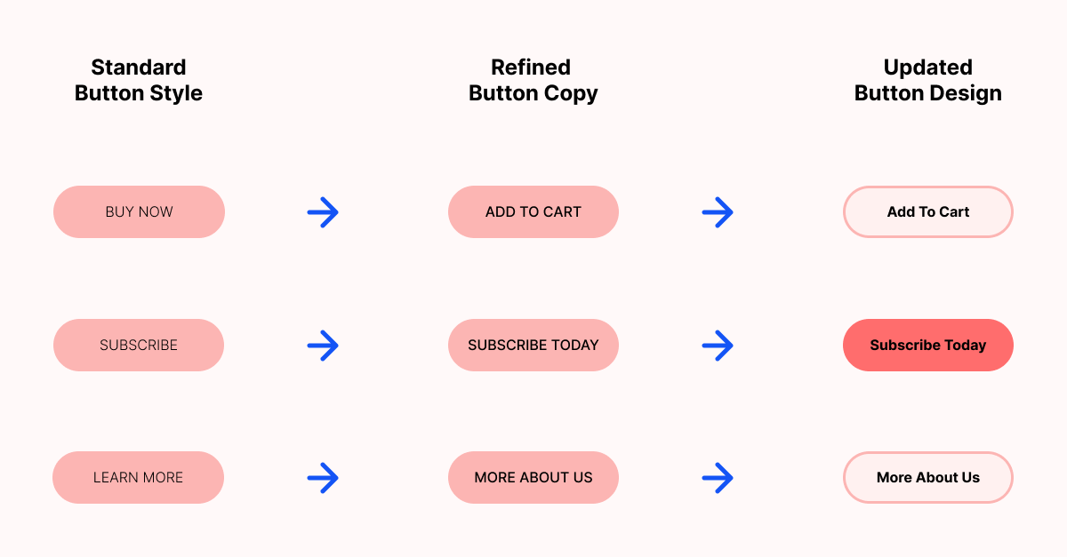
2. Clear Call To Actions
We talked about limiting too many call-to-actions, so what is a clear CTA? When we design a page, we always ask ourselves, "What if we could only make the user take one next step? What would it be?" If the user is looking at a product page, the next step we want them to take is to add the product to their cart or checkout. Knowing this, we want the checkout button to be the most significant and brightest button or element on the page with no secondary details surrounding it. This allows the user to see their next step clearly and engage with it appropriately.
3. Simplify your navigational items
Along with clear CTAs, we want our site to have a simple navigational set-up as well. There are a few best-practices for navigation on a site; for example, items like hamburgers and breadcrumbs play a role. When choosing what should live in a nav bar, think back to the previous point of a clear call to action. What is the most crucial next step the user should take? These items should be presented, in order, within a navbar.
4. Create a distraction-free checkout process
Your site should keep distractions or side steps to a minimum throughout the entire user experience process. However, this is very important during the user's checkout process. Distraction and hassle-free checkouts allow users to worry less about "making the right decision" and more about finishing the checkout process. A great way to keep the user on track with checking out is to include progress indicators, so the user knows how many more steps they have to take before ordering their product.
5. Product organization
Product organization is key to a seamless user experience. Many users have become accustomed to specific features when shopping online. Features like product filters or breadcrumb links are featured on many successful e-commerce websites, as they help the user find what they are searching for quickly and allow them to see where they've already been. For those that might not know, filters help product searches, and breadcrumbs are a series of links or pages the user has already visited. If you have many products showcased on your site, it can be overwhelming to organize it all efficiently. So, think about it like this; how would you organize a physical location? Would you put women's stocks with men's tee-shirts? If your answer was no, you're on the right track! When featuring or showcasing product pages, always group like products together. For example, if you are selling men's shoes, your site might feature men's socks at the bottom.
6. Uncomplicated payment and shipping options
Uncomplicated payment and shipping options sound more complicated than they are! Simple payments are somewhat else exploratory. If your website hosting platform offers more than one payment method, be sure to showcase that on your checkout page! Payment options like PayPal, Apple Pay, and Google Pay can help users check out quickly and seamlessly. The same process goes for shipping options too. If you are not offering free shipping on your entire store, creating one or two pre-priced shipping options helps users see the flat rate they are adding to their total. Be mindful, though! Some users do not complete the checkout process if a shipping rate is too high!
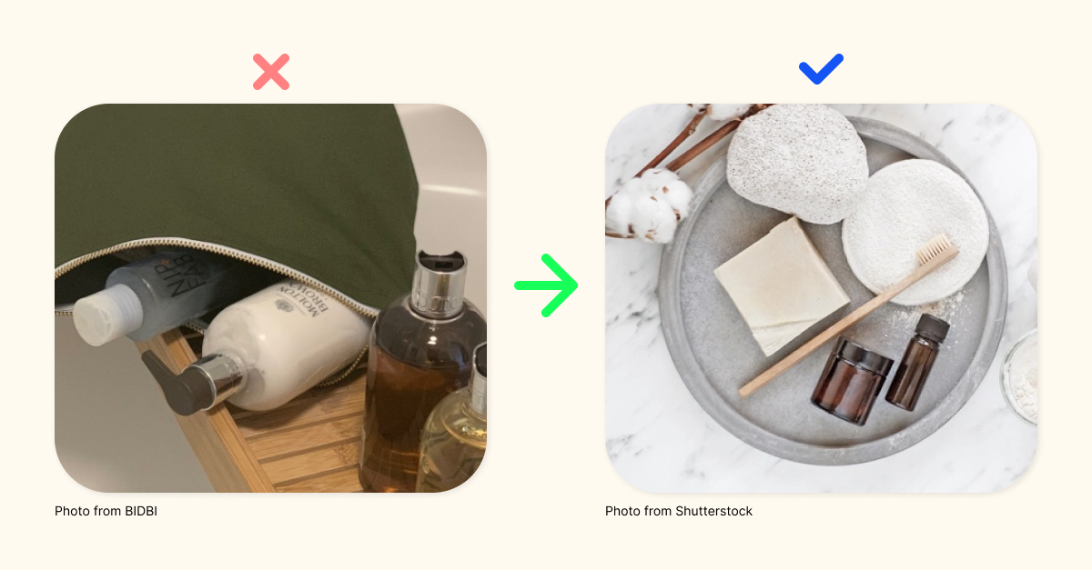
7. Clean and consistent product images
Almost no one shopping online buys an item without seeing it first. Clean product images have only the product in the shot and have a busy free background. It's always recommended when creating product images to use one colored background. This doesn't have to be a white wall, though! Using items like cardstock or colored posterboard can provide a cost-effective and straightforward way to change your images' background without having to spend a ton of time retouching your photos. When you are happy with your background and product composition, use the same environment for your products. This will help with site consistency.
8. Detailed product descriptions
When listing a new product in your store, you'll want to match great product images with a detailed item description. This is the critical opportunity to let your users know everything the photos cannot already tell them, including details like how the item feels or smells, how to use the thing, what ingredients are included, etc. Do not feel like you need to keep this section short. You can have long product descriptions. However, it should be an option to read more, not a requirement.
9. Upfront Customer Reviews
Creating trust with a new customer is key to generating consistent sales. The user or customer must trust what your product is before buying. This process can be complicated, especially online, as the user can't physically inspect the item. Many users base their trust on what other customers that have already tried the product have to say about it! Positive or negative customer reviews are essential to a successful e-commerce site. Many stores might place these reviews on the homepage or landing page of a site. Although this is a significant element to up upfront, it's not the best place for it. Moving your product reviews to individual product pages can help your user see all the details right on the product page.
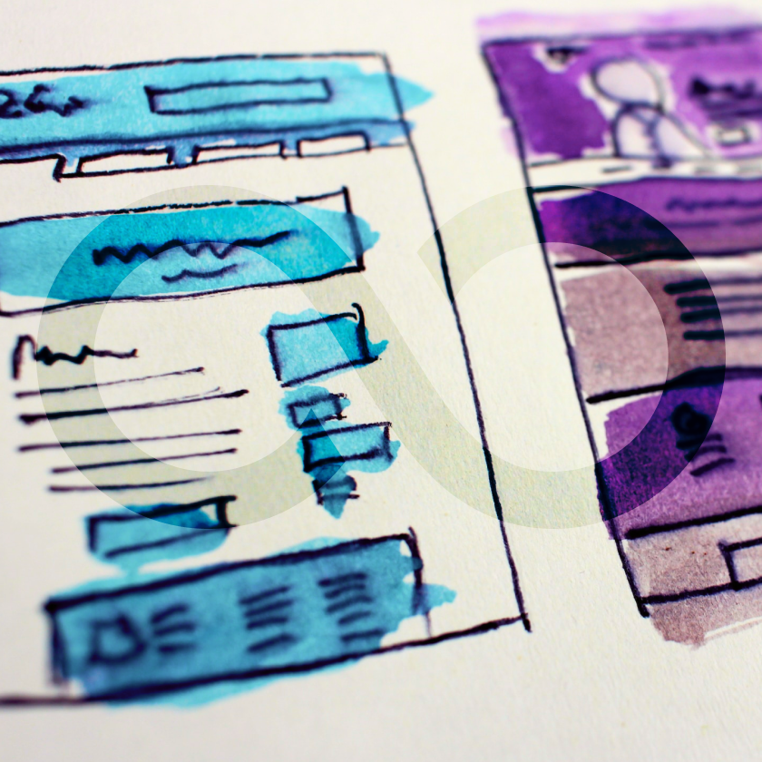
We can see online information from just about anywhere today, even right from our wrists. Therefore, your site must be compliant with these devices. Although your desktop site looks fantastic, how does it transform to mobile devices? An excellent exercise for this process is to mock-up your desktop site before building it. Once you are finished with the desktop mock-up, use the existing elements to mock-up a mobile version! (You can switch the order as well, mobile-first, desktop second) Is there an image or bit of text that is too big or too small? Consider replacing this element on both versions of your site for the utmost consistency!
11. Email vs. Final sale
Not all users that land on your site is going to be final sales. It's a win that you got them to land on your site in the first place! With that being said, you don't want them to leave empty-handed. Getting access to a user's inbox is as essential as a final sale. To gather emails, you'll need to give the user an incentive to return to your site. Incentives can vary depending on your comfort with what to offer for free. The user can only claim these items if they give you their email or subscribe to your newsletter. Some examples of positive incentives could be; coupons, free lessons, trial products, or limited offers.
12. Product recommendations
A common practice is to recommend more products to customers when they look into one specific item on your site. Although this practice can help lead to extensive sales, it can also cause confusion and misguidance on your site. Going back to the previous method of "product organization," you'll want to be mindful of where you place new product recommendations. The best place(s) to add suggestions are on a specific product page, product category pages, or during the first step of your checkout process.
13. FAQ sections
Along with detailed product descriptions, another item to included within your site is an FAQ section. Many places have their FAQ's high-up on their home or product pages. This isn't the best way to display this type of information. Any question that the user should ask or needs to know should be within a description or copy section of your site. FAQ's should be for specific or common questions that the user doesn't recognize first hand.
14. Simplify your landing page
A simple landing page or homepage is key to letting your user know all essential information before looking into any other items. Start by making a list of important information that shows your products and what the user should know. For example, how the product is made? Where are your hot products? How does it help the customer? What makes the product special? The answers to these questions should be the only items on a landing page. Get creative with the layout, though! You don't have to have four or five blocks of text to answer the questions correctly.
15. Consistency
Throughout this article, you might have noticed many callouts for keeping consistency on your site. This is because consistency is required for having a successful store. If a user becomes lost or confused while exploring your area, they'll become less likely to finish a sale. Consistency can also help minimize your workload when building a site from a blank canvas! Use the same creative assets throughout your entire site; not every page needs a new element!
Special thanks to Floship for providing a few bits of content within this post.
Thanks for reading through all 15 Best UX eCommerce Site Practices For 2023. We hope you found this article helpful! If you did, consider subscribing to the blog below.